Fall 2025 Color Palette: 3 Hues for Maximum ROI
Fall 2025 color palette predictions indicate a shift towards grounding, nature-inspired hues, presenting significant ROI opportunities for businesses that strategically invest in emerging trends like deep teal, muted terracotta, and golden ochre.
As the leaves prepare to turn, fashion and design are already looking ahead. Get ahead of the curve with our Fall 2025 Color Palette Predictions: Invest Now in These 3 Hues for Maximum ROI and position your business for success.
Fall 2025 Color Trends: An Overview
Predicting color trends for future seasons is a complex blend of art and science. It involves analyzing socio-cultural movements, monitoring runway shows, and observing consumer behavior to anticipate the shades that will resonate with the public. Let’s explore the predicted top hues for Fall 2025.
This article will dissect the three key colors predicted to dominate Fall 2025, offering insights into their appeal and potential applications. By understanding these trends, businesses and creatives alike can make informed decisions, maximizing their return on investment.
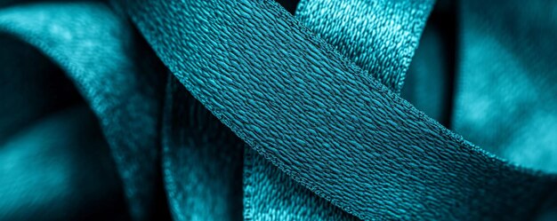
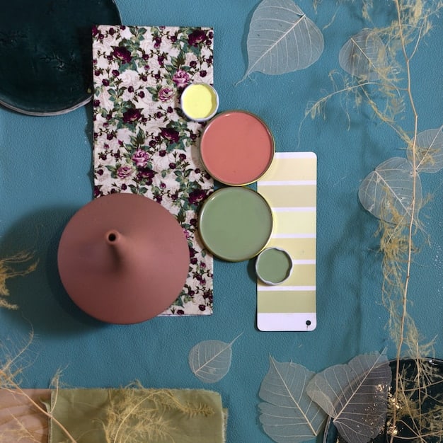
Deep Teal: The Color of Tranquility and Sophistication
Deep teal, a captivating blend of blue and green, is poised to be a standout color for Fall 2025. Its versatility lends itself to both fashion and interior design, evoking feelings of tranquility and sophistication.
This section analyzes why deep teal is predicted to be a top color choice, its potential applications across various industries, and tips for incorporating it into your designs to capitalize on its upcoming popularity.
The Psychology of Deep Teal
Colors have a profound impact on our emotions and perceptions. Deep teal, in particular, combines the calming qualities of blue with the revitalizing energy of green, making it a psychologically appealing choice. This balance creates a sense of serenity and sophistication, which is highly desirable in today’s fast-paced world.
Applications in Fashion and Design
In the fashion industry, deep teal can be used to create elegant evening gowns, comfortable knitwear, and stylish accessories. It pairs well with neutral tones like beige and gray, as well as complementary colors like mustard yellow and burgundy. In interior design, deep teal can serve as an accent wall color, upholstery choice, or decorative accessory. Its ability to add depth and richness to a space makes it a popular choice for creating inviting and visually stimulating environments.
- Fashion: Evening gowns, knitwear, accessories.
- Interior Design: Accent walls, upholstery, decorative accessories.
- Marketing: Branding, website design, promotional materials.
Deep teal is not just a color; it’s a statement. Its versatility ensures that it will be a prominent shade in Fall 2025, offering numerous opportunities for creative expression and commercial success.
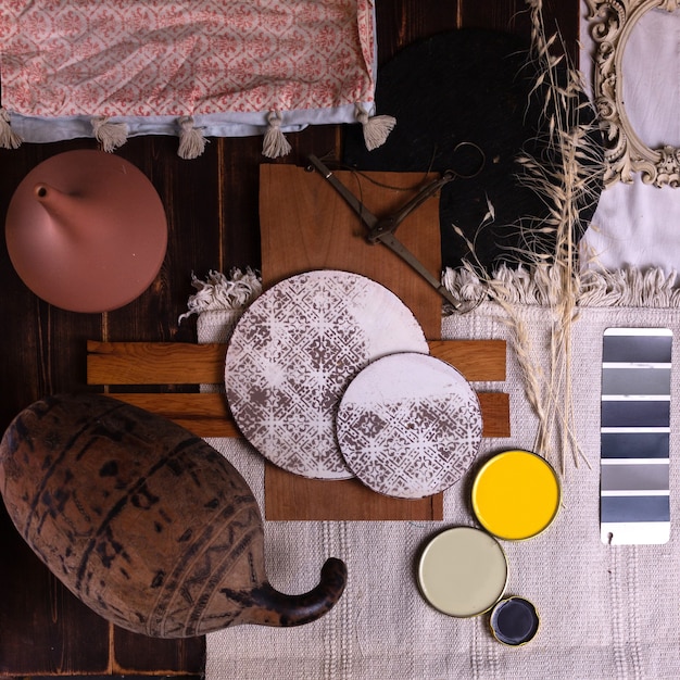
Muted Terracotta: Embracing Earthy Warmth
Muted terracotta, characterized by its warm, earthy tones, is on track to be another key color for Fall 2025. This hue brings a sense of comfort and nostalgia, connecting us to the natural world and providing a soothing contrast to the cooler shades of autumn.
This section explores the reasons behind the rising popularity of muted terracotta, its diverse applications in fashion, design, and branding, as well as practical tips for leveraging this color to create welcoming and engaging environments.
The Appeal of Natural Hues
In an era dominated by technology, there’s a growing desire to reconnect with nature. Muted terracotta perfectly captures this sentiment, offering a grounding and organic aesthetic that resonates with consumers. Its subtle warmth evokes feelings of comfort and security, making it an ideal choice for creating inviting spaces.
Integrating Muted Terracotta into Your Brand
Brands can leverage muted terracotta to convey a sense of authenticity and reliability. This color works well in branding materials, packaging, and website design, helping to create a cohesive and approachable brand identity. In retail environments, muted terracotta can be used to create warm and inviting displays, encouraging customers to linger and explore.
- Branding: Logos, packaging, website design.
- Retail: Store displays, interior décor.
- Fashion: Casual wear, outerwear, accessories.
Muted terracotta is more than just a color; it reflects a broader cultural shift towards sustainability and natural living. Embracing this trend can help businesses connect with consumers on a deeper level, fostering loyalty and driving sales.
Golden Ochre: Radiating Optimism and Energy
Golden ochre, a vibrant and sunny hue, is forecasted to be a major trend for Fall 2025. This color exudes optimism and energy, offering a cheerful contrast to the more subdued tones typically associated with the autumn season.
This section delves into the factors driving the popularity of golden ochre, its versatile applications in fashion, design, and marketing, and actionable strategies for incorporating this color into your projects to create dynamic and engaging experiences.
The Psychology of Optimistic Colors
Colors have a powerful influence on our moods and perceptions. Golden ochre, with its warm and radiant qualities, is known to evoke feelings of happiness and enthusiasm. In uncertain times, people often gravitate towards colors that uplift their spirits and inspire hope.
Practical Applications Across Industries
In the fashion industry, golden ochre can be used to create eye-catching statement pieces like jackets, dresses, and accessories. It pairs well with neutral tones like navy and charcoal, as well as complementary colors like deep teal and rust. In interior design, golden ochre can be used to create focal points, such as accent walls or statement furniture. Its ability to add warmth and vitality to a space makes it a popular choice for creating welcoming and energetic environments.
- Fashion: Jackets, dresses, accessories.
- Interior Design: Accent walls, statement furniture.
- Marketing: Promotional materials, website design.
Golden ochre is a versatile and impactful color that can bring a sense of joy and energy to any project. By embracing this trend, businesses can create positive and memorable experiences that resonate with their target audience.
Combining the Palette
While each color stands out on its own, their true potential is unlocked when combined. A deep teal dress paired with a golden ochre scarf can create a sophisticated yet vibrant look. In interior design, a room with muted terracotta walls can be accented with deep teal cushions and golden ochre artwork. These combinations create a harmonious and balanced aesthetic that is both visually appealing and emotionally resonant.
Experimenting with different combinations of these colors is key to finding the perfect balance for your particular brand or project. Don’t be afraid to mix and match to create unique and memorable designs.
Maximizing ROI Through Color Selection
Investing in the right colors can significantly impact your ROI. By anticipating trends and incorporating them strategically, businesses can increase their appeal, drive sales, and enhance their brand image. Here are some actionable steps to maximize your ROI through color selection.
This section provides practical strategies for businesses to capitalize on the predicted Fall 2025 color trends, with insights into market analysis, consumer behavior, and effective color implementation techniques.
Conduct Market Research
Before investing in any color trend, it’s crucial to conduct thorough market research. This involves analyzing your target audience, monitoring competitor activity, and staying up-to-date with industry trends. By understanding the preferences and needs of your customers, you can make informed decisions about color selection.
Implement Strategically
Once you’ve identified the colors that resonate with your target audience, it’s important to implement them strategically. This involves incorporating these colors into your product designs, marketing materials, and retail environments in a way that is both visually appealing and brand-consistent. Consider how colors influence purchase decisions, and how to create environments that enhance product appeal.
By carefully selecting and implementing these colors, businesses can create a cohesive and engaging brand experience that drives sales and fosters customer loyalty.
| Key Point | Brief Description |
|---|---|
| 🎨 Deep Teal | Sophisticated blend of blue and green, evoking tranquility. |
| 🍂 Muted Terracotta | Earthy tone offering comfort and nostalgia. |
| ☀️ Golden Ochre | Vibrant hue radiating optimism and energy. |
| 📈 ROI Maximization | Strategic color selection boosts appeal and sales. |
Frequently Asked Questions
▼
The key colors predicted for Fall 2025 are deep teal, muted terracotta, and golden ochre. These hues offer a combination of tranquility, warmth, and optimism, catering to diverse consumer preferences.
▼
Deep teal can be integrated into fashion as elegant evening gowns or comfortable knitwear. For interior design, it works well as an accent wall color or upholstery choice, adding depth and sophistication to any space.
▼
Muted terracotta’s popularity stems from its connection to nature, offering a grounding and organic aesthetic. It provides a sense of comfort and security, aligning with consumers’ desire for authenticity.
▼
Golden ochre is versatile and can be used across industries such as fashion, interior design, and marketing. In fashion, it adds eye-catching appeal to statement pieces. In design, it can create focal points and energetic atmospheres.
▼
To maximize ROI, businesses should conduct market research to understand consumer preferences and implement these colors strategically into product designs, marketing materials, and retail environments for consistent brand appeal.
Conclusion
By understanding and embracing the Fall 2025 Color Palette Predictions: Invest Now in These 3 Hues for Maximum ROI – deep teal, muted terracotta, and golden ochre – businesses and creatives can position themselves for success in the upcoming season, ensuring that their investments in color bring significant returns.


