Mixing Prints Like a Pro: Dos & Don’ts for Stylish Outfits
Mixing prints can elevate your style, but it requires a keen eye; this guide outlines the essential dos and don’ts to create cohesive and fashionable outfits by understanding scale, color harmony, and balancing bold and subtle patterns.
Are you ready to add some excitement to your wardrobe? Embracing the art of mixing prints can transform your style from simple to stunning. However, navigating this fashion-forward technique can be tricky. Let’s dive into the dos and don’ts of mixing prints to create stylish and cohesive outfits.
Understanding the Basics of Print Mixing
Mixing prints might seem daunting, but it’s an achievable skill with some foundational knowledge. It’s about creating a balance that showcases personality while maintaining a polished appearance. Let’s explore some key concepts to get you started.
What Exactly is Print Mixing?
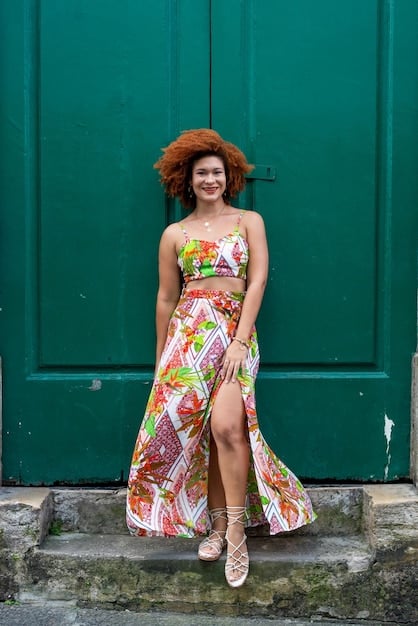
Print mixing is the art of combining different patterns in a single outfit, such as florals, stripes, polka dots, and animal prints. It’s a bold statement that demonstrates confidence and creativity.
Why Mix Prints?
Mixing prints allows for creative expression and originality. It’s a fantastic way to breathe new life into your wardrobe and showcase your unique style. You can turn ordinary outfits into extraordinary looks by mastering this technique.
- Adds Visual Interest: Mixing prints breaks up the monotony of solid colors and single patterns.
- Showcases Personality: It demonstrates a willingness to experiment and express individuality.
- Creates Unique Looks: Combining different patterns can result in outfits that stand out and get noticed.
Ultimately, understanding the basics sets the stage for successful print mixing, encouraging creativity while providing a framework for pulling together stylish and harmonious looks.
Do: Start with a Common Color Palette
One of the most important things in mixing prints is using a common color palette. When the colors are harmonious, mixing different prints becomes easier and more visually appealing. Here’s how to do it effectively.
How to Find a Common Color
Look for prints that share at least one color. This unifying element ties the outfit together and prevents it from looking disjointed. This matching color serves as a thread that weaves the different patterns together seamlessly.
Examples of Harmonious Color Combinations
Consider pairings like a navy and white striped shirt with a floral skirt that includes navy or white. Another great option is a burgundy and cream polka dot blouse with a scarf that features similar tones. Sticking to complementary colors helps to avoid clashes.
- Monochromatic: Varying shades of the same color (e.g., light blue stripes with dark blue florals).
- Analogous Colors: Colors next to each other on the color wheel (e.g., green stripes with blue floral patterns).
- Complementary Colors: Colors opposite each other on the color wheel (e.g., yellow polka dots with purple geometric patterns, use these sparingly).
By choosing patterns with a common color presence, your mixed prints will appear more deliberate and less haphazard, ensuring a well-coordinated and stylish ensemble.
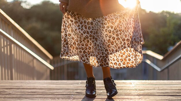
Don’t: Overlook the Scale of Prints
The scale of your prints is crucial for balance. Mixing prints that are too similar in size can create a confusing visual effect. Here’s how to get the scale just right.
Why Scale Matters
When two prints are too close in size, they can compete with each other, making the outfit visually overwhelming. Varying the scale helps create a sense of harmony and prevents a cluttered, chaotic look.
Combining Large and Small Prints
Pair a large-scale floral print with a small-scale polka dot or stripe. The contrast in size provides visual interest and prevents one pattern from overpowering the other, creating a balanced and appealing aesthetic.
- Dominant Print: Choose one larger print to be the focal point of the outfit.
- Subordinate Print: Select a smaller print that complements without competing.
- Consider Texture: Include textured fabrics to further break up the visual monotony.
Getting the scale right helps ensure that your mixed prints complement each other for an effortlessly chic and visually pleasing look.
Do: Treat Neutrals as Prints
Neutral colors like black, white, gray, and beige act as a bridge to combining bolder patterns. Treating them as prints can give you more freedom and creativity in mixing and matching. Here’s how to make the most of neutrals.
The Role of Neutrals in Print Mixing
Neutrals can balance and neutralize bold patterns. For easier ensembles, consider black and white stripes as a neutral base that can be paired with nearly any color or print.
Examples of Using Neutrals Effectively
Pair a brightly colored floral top with black and white striped pants. Conversely, combine a neutral animal print with a brightly colored or patterned skirt. Neutrals offer a versatile foundation that enhances and grounds bolder choices.
- Anchor Piece: Use a neutral print as the main element and build around it.
- Accessorize: Integrate neutral accessories to tie the outfit together.
- Break Up Patterns: Use neutral layers like jackets or cardigans to separate competing prints.
Using neutrals strategically in print mixing can ease the process and create balanced, chic outfits that reflect a confident sense of style.
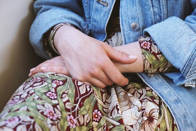
Don’t: Be Afraid of Mixing Textures
Texture is another key element that can enhance your print mixing efforts. Combining different textures adds depth and sophistication to your overall look. Here’s how to incorporate texture effectively.
The Impact of Texture
Mixing textures prevents your outfit from appearing flat and one-dimensional. Combining fabrics like silk, cotton, and denim can add visual interest and sophistication to your mixed print ensembles.
Pairing Textures Successfully
Try pairing a silky floral blouse with a tweed skirt; this adds a luxurious feel. A denim jacket over a patterned dress can also create a casual yet stylish look. Playing with textures adds another layer of complexity and style to your outfits.
- Contrast: Combine rough with smooth textures (e.g., denim with silk).
- Balance: Avoid overwhelming the outfit with too many textures.
- Seasonality: Consider seasonal appropriateness (e.g., wool in winter, linen in summer).
Experimenting with texture elevates your print mixing, adding a multi-dimensional aspect that creates captivating and stylish outfits.
Do: Use Accessories to Tie it Together
Accessories are your best friends when mixing prints. They can either enhance the cohesion of your outfit or serve as a contrasting element. Here’s how to use accessories to your advantage.
How Accessories Can Help
Accessories like scarves, belts, jewelry, and shoes can tie mixed prints together. A belt in a complementary color can define the waist, while a scarf can introduce another print element. They also help further express your individuality.
Choosing the Right Accessories
If your outfit is print-heavy, opt for neutral accessories to balance the look. If the prints are more subtle, consider bolder accessories to add a pop of color or visual interest. Consider metallic accents to add sophistication.
- Color Coordination: Choose accessories that pick up on one of the colors in your prints.
- Keep it Simple: Avoid overwhelming the outfit with too many accessories.
- Statement Pieces: A bold handbag or pair of shoes can pull everything together.
Skillfully chosen accessories add the finishing touches to your mixed print outfits, ensuring a well-rounded and polished appearance. They should amplify the intention of your look.
Don’t: Overdo It
Knowing when to stop is as important as knowing how to start. Overdoing it can lead to a chaotic and overwhelming appearance. Here’s how to maintain balance and avoid overdoing your mixed print look.
The Importance of Balance
Aim for a balance between prints and solids. Mixing too many bold patterns can create a visually jarring effect. In the pursuit of maximalism, remember that there is still a line to observe.
Tips for Avoiding Print Overload
Limit your outfit to two or three prints. Use solid-colored pieces to break up the patterns and offer visual relief. Take a step back and assess the overall look in a mirror before heading out.
- Solid Separates: Balance a patterned top with solid-colored bottoms, or vice versa.
- Color Harmony: Ensure the colors in your prints complement each other.
- Edit Ruthlessly: If you’re unsure, remove one patterned item at a time until the look feels balanced.
Understanding when to stop ensures that your mixed print outfits remain chic and polished, rather than overwhelming and chaotic.
| Key Point | Brief Description |
|---|---|
| 🎨 Color Palette | Ensure prints share a common color for harmony. |
| 📏 Scale | Mix prints with varying scales to avoid visual competition. |
| ⚫ Neutrals | Treat neutrals as prints to balance bolder patterns. |
| ✨ Accessories | Use accessories to tie prints together or add contrast. |
Frequently Asked Questions
▼
Start with black and white stripes and pair them with a floral print. This is a simple way to get comfortable with mixing prints because the stripes act almost as a neutral.
▼
Yes, but proceed with caution. Ensure the animal prints have a common color or are different scales. Pairing a small leopard print with a large zebra print can work well.
▼
Color is very important! It’s best to choose prints that share at least one common color to create a harmonious and balanced look. This helps tie the outfit together visually.
▼
Denim, leather, and knit fabrics can add contrast and interest to mixed print outfits. Pairing a silk print with a denim jacket or leather pants can create a stylish edge.
▼
Yes, but keep it subtle. Opt for muted colors and classic prints. A skirt with a subtle print paired with a neutral blouse and blazer can work. Always consider the workplace culture.
Conclusion
Mastering the art of mixing prints opens up endless possibilities for expressing your unique style. By following these dos and don’ts, you can create interesting, cohesive outfits that showcase your fashion-forward sensibilities.


