Color Psychology: What Your Seasonal Fashion Choices Say About You
Advertisements
Understanding the color psychology behind seasonal fashion choices reveals how hues impact mood, perception, and self-expression, influencing both personal feelings and how others interpret your style.
Have you ever stopped to consider why certain colors dominate your wardrobe during specific times of the year? The truth is, the color psychology behind seasonal fashion choices: what your clothes say about you, is far more intricate than mere trends. It delves into subconscious associations, cultural influences, and personal expressions that collectively shape our seasonal sartorial narratives.
Advertisements
The foundational principles of color psychology in fashion
Color psychology is the study of how different hues affect human behavior, mood, and perception. In fashion, this translates into a powerful, non-verbal communication tool. Every shade we choose, consciously or unconsciously, sends a message about our personality, our emotional state, and even our intentions. This isn’t just about looking good; it’s about feeling good and communicating effectively through your attire.
The impact of color in fashion extends beyond personal expression to influence how others perceive us. Bright, bold colors can convey confidence and dynamism, while softer, muted tones might suggest approachability or introspection. Understanding these foundational principles allows for more intentional wardrobe choices, transforming daily dressing into a strategic act of self-presentation.
Advertisements
The emotional spectrum of colors
Different colors evoke distinct emotional responses. For instance, red is often associated with passion and energy, while blue typically brings to mind calm and stability. These associations are deeply ingrained in our collective consciousness, stemming from natural phenomena and cultural symbolism. When applied to fashion, these emotional associations become potent tools for conveying a desired persona.
- Red: Power, passion, energy, confidence, urgency.
- Blue: Calm, trust, stability, professionalism, serenity.
- Yellow: Happiness, optimism, warmth, creativity, caution.
- Green: Nature, growth, harmony, freshness, tranquility.
- Black: Sophistication, elegance, mystery, authority, formality.
- White: Purity, innocence, simplicity, cleanliness, new beginnings.
By carefully selecting colors, individuals can curate their image to align with specific occasions, moods, or desired outcomes. This deliberate use of color moves beyond simple aesthetics, tapping into a deeper psychological level of communication. It allows for a nuanced expression that can subtly shift perceptions and interactions.
Ultimately, the foundational principles of color psychology in fashion underscore the idea that clothing is never just fabric and stitches. It is a canvas for self-expression, a medium for emotional resonance, and a powerful instrument for non-verbal communication, all amplified by the strategic use of color.
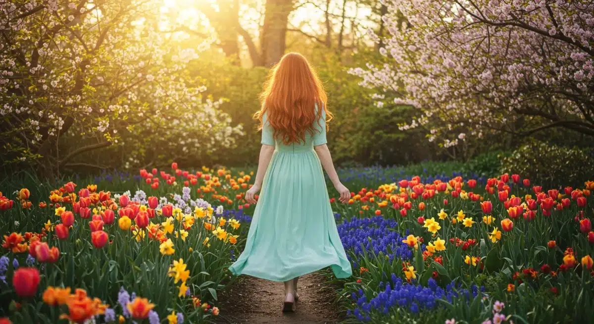
Spring’s palette: rebirth and fresh beginnings
As winter’s chill recedes, spring ushers in a season of renewal, growth, and vibrant energy. This profound shift in nature is beautifully mirrored in our fashion choices, where the color psychology of spring revolves around themes of rebirth, freshness, and optimism. Our wardrobes lighten up, not just in fabric weight, but also in hue, embracing shades that reflect the blossoming world around us.
Think of the soft pastels and bright, cheerful tones that dominate spring collections. These colors are not arbitrary; they are deeply connected to the psychological impact of the season itself. They evoke feelings of hope, joy, and a sense of new possibilities, drawing parallels with the burgeoning life that emerges after a period of dormancy. This connection makes spring fashion inherently uplifting and invigorating.
The rise of pastels and brights
Pastel colors, such as mint green, baby blue, soft pink, and lavender, are quintessential spring choices. They symbolize tenderness, innocence, and delicate beauty, perfectly capturing the gentle awakening of nature. These softer shades create an approachable and serene aura, often associated with youthfulness and lightheartedness. They are perfect for conveying a sense of calm optimism.
- Mint Green: Freshness, growth, tranquility, healing.
- Baby Blue: Serenity, peace, openness, stability.
- Soft Pink: Gentleness, romance, compassion, sweetness.
- Lavender: Spirituality, imagination, luxury, creativity.
Alongside pastels, brighter, more saturated colors also make a prominent appearance in spring fashion. Hues like sunny yellow, coral, and vibrant teal inject a dose of energy and playfulness. These colors reflect the increasing daylight and warmth, signaling a departure from the muted tones of winter. They encourage a more outgoing and enthusiastic demeanor, aligning with the season’s energetic vibe.
The combination of soft pastels and cheerful brights in spring fashion creates a versatile palette that allows for both understated elegance and bold statements. This duality reflects the complex emotional landscape of spring – a time of gentle awakening, yet also vibrant, burgeoning life. Wearing these colors not only makes us feel more connected to the season but also subtly communicates our readiness for new beginnings and positive change.
Summer’s allure: vibrancy and boundless energy
Summer is synonymous with long, sunny days, outdoor adventures, and a general sense of freedom and exuberance. The color psychology behind seasonal fashion choices for summer perfectly encapsulates this spirit, favoring vibrant, bold, and often warm hues that reflect the intensity of the sun and the joy of the season. Our wardrobes shift to accommodate lighter fabrics and a more adventurous color palette, signaling a departure from the more subdued tones of other seasons.
The colors we gravitate towards in summer are often those that evoke feelings of happiness, energy, and excitement. They are a visual representation of summer’s boundless possibilities, from beach vacations to lively gatherings. This psychological connection makes summer fashion inherently dynamic and expressive, encouraging us to embrace a more carefree and outgoing persona.
Bold and bright declarations
Deep blues, reminiscent of clear ocean waters, and bright yellows, mirroring the sun, are staples of summer fashion. These colors not only look refreshing but also psychologically uplift the wearer and those around them. They convey confidence and an adventurous spirit, perfectly aligning with the season’s call for exploration and enjoyment. The vibrancy of these colors helps us stand out and embrace the joyful atmosphere.
- Ocean Blue: Calm, refreshing, expansive, trustworthy.
- Sunny Yellow: Joy, optimism, energy, creativity, warmth.
- Coral/Orange: Enthusiasm, excitement, warmth, creativity, friendliness.
- Turquoise: Serenity, clarity, invigoration, sophistication.
Beyond the primary brights, neon colors and electric shades also find their moment in the summer sun. These highly saturated hues are attention-grabbing and convey a sense of playfulness and modernity. They are often chosen by those who wish to make a bold statement and fully embrace the energetic, sometimes audacious, spirit of summer. Wearing neon can be a powerful way to express confidence and a daring attitude, resonating with the season’s vibrant pulse.
The overarching theme for summer fashion colors is one of uninhibited expression and vitality. From the soothing depths of ocean blues to the fiery passion of coral, each color contributes to a narrative of summer as a time of celebration and freedom. By choosing these vibrant shades, we not only dress for the weather but also for the mood of the season, projecting an image of energy and boundless enthusiasm.
Autumn’s embrace: warmth and introspection
As the vibrant energy of summer begins to wane, autumn arrives with a distinct shift in atmosphere, ushering in a season of warmth, reflection, and a return to richer, more grounded tones. The color psychology behind seasonal fashion choices for autumn beautifully mirrors this transition, moving towards a palette inspired by changing leaves, harvest bounty, and cozy evenings. Our wardrobes become a canvas for expressing a sense of comfort, sophistication, and thoughtful introspection.
The colors we choose in autumn are often those that evoke feelings of coziness, stability, and a deep connection to nature’s cycles. They reflect the season’s inherent beauty and the natural inclination towards introspection as we prepare for the cooler months. This psychological connection makes autumn fashion rich, inviting, and deeply comforting, encouraging a more grounded and reflective persona.
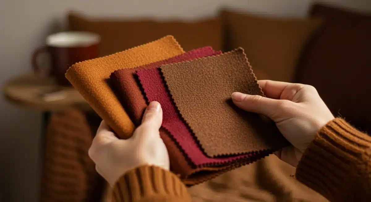
Earthy tones and jewel shades
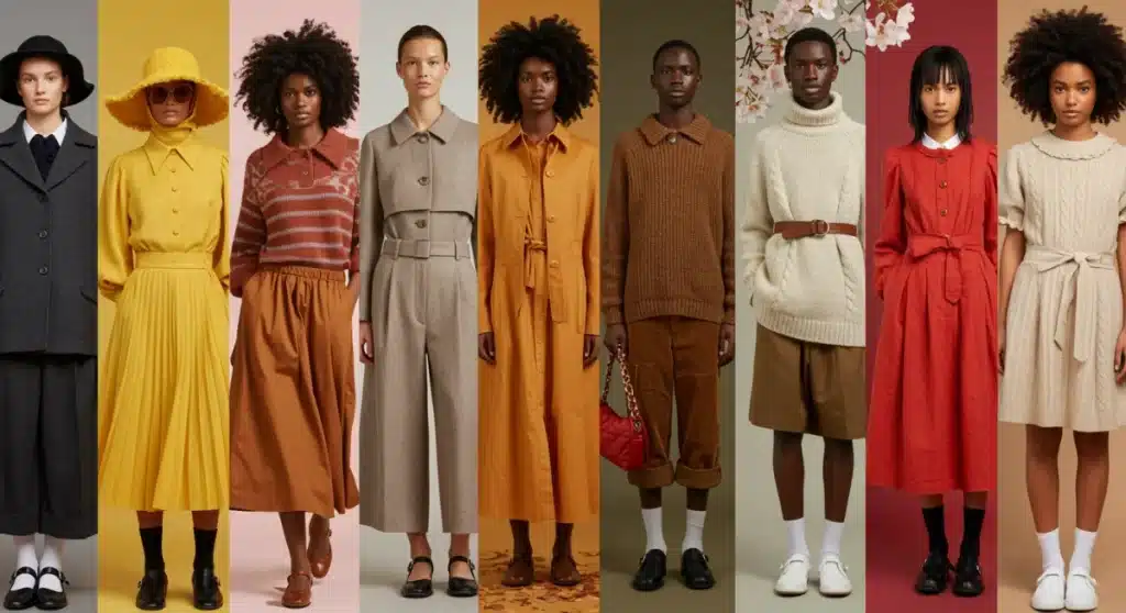
Autumn’s signature palette is dominated by earthy tones and rich jewel shades. Colors like deep reds, burnt oranges, mustard yellows, olive greens, and various shades of brown are paramount. These hues are directly inspired by the natural world during fall, from the changing foliage to the fertile soil. They convey a sense of warmth, stability, and a connection to tradition, making them incredibly appealing during this time of year.
- Deep Red/Burgundy: Sophistication, passion, warmth, richness.
- Burnt Orange: Creativity, enthusiasm, comfort, autumn harvest.
- Mustard Yellow: Wisdom, warmth, vintage charm, creativity.
- Olive Green: Nature, growth, resilience, sophistication.
- Chocolate Brown: Stability, reliability, warmth, earthiness.
Complementing these earthy shades are luxurious jewel tones such as emerald green, sapphire blue, and amethyst purple. These colors add a touch of elegance and depth to the autumn wardrobe, often associated with richness, luxury, and a sense of refinement. They provide a beautiful contrast to the more rustic earthy tones, allowing for a sophisticated and layered aesthetic that is characteristic of fall fashion.
The psychological impact of autumn colors is one of comfort and groundedness. They invite us to slow down, appreciate the beauty of the present, and prepare for the quietude of winter. By embracing these rich and warm hues, we not only align our style with the season but also project an image of thoughtful elegance and a deep appreciation for the natural world. Autumn fashion, therefore, becomes a harmonious blend of natural beauty and sophisticated expression.
Winter’s elegance: sophistication and serene stillness
Winter, with its crisp air and often muted landscapes, brings a unique shift in the color psychology behind seasonal fashion choices. This season calls for a palette that reflects both the serene stillness of snow-covered scenes and the need for warmth and sophistication. Our wardrobes transition to deeper, richer, and often cooler tones, conveying a sense of elegance, formality, and sometimes, a touch of mystery.
The colors we choose in winter are those that evoke feelings of calm, strength, and refined beauty. They align with the season’s introspection and the desire for comfort and protection against the cold. This psychological connection makes winter fashion inherently sophisticated and often timeless, encouraging us to embrace a more composed and distinguished persona.
Cool tones and classic neutrals
Cool tones are predominant in winter fashion. Shades like deep blues, icy grays, and forest greens mirror the winter landscape, creating a sense of tranquility and depth. These colors are often associated with calmness, stability, and an understated elegance. They provide a refreshing contrast to the warmth of autumn and prepare us for the quiet beauty of winter.
- Navy Blue: Authority, trust, professionalism, sophistication.
- Charcoal Gray: Formality, strength, sophistication, neutrality.
- Forest Green: Nature, growth, stability, luxury, depth.
- Icy Blue: Purity, calm, clarity, coolness.
Classic neutrals, such as black, white, and various shades of beige and camel, are also essential components of the winter palette. Black, in particular, is a perennial favorite, symbolizing sophistication, power, and timeless elegance. White evokes purity and the crispness of snow, while beige and camel tones offer warmth and versatility. These neutrals provide a strong foundation for any winter wardrobe, allowing for layering and the strategic introduction of accent colors.
The psychological impact of winter colors is one of strength and refinement. They suggest a sense of composure and an appreciation for classic style. By embracing these cool tones and classic neutrals, we not only dress appropriately for the weather but also project an image of quiet confidence and sophisticated grace. Winter fashion, therefore, becomes a statement of enduring elegance and serene strength, perfectly capturing the essence of the season.
Beyond the season: personal style and color expression
While seasonal trends provide a valuable framework, the true power of color psychology in fashion lies in its application to personal style. Understanding how colors interact with our individual complexions, personalities, and desired self-expression allows us to transcend fleeting trends and cultivate a wardrobe that truly reflects who we are. This goes beyond simply following seasonal dictates; it’s about making conscious choices that resonate with our inner selves.
Personal style is a unique language, and color is one of its most eloquent dialects. It allows us to communicate nuances about our mood, our values, and our aspirations without uttering a single word. When we align our color choices with our authentic selves, our fashion becomes a powerful tool for self-affirmation and connection.
The role of undertones and personal palettes
One crucial aspect of personal color expression is understanding your skin’s undertones. Whether you have warm, cool, or neutral undertones significantly influences which colors will flatter you most. Wearing colors that harmonize with your undertones can make your skin glow, your eyes sparkle, and your overall appearance more vibrant, regardless of the current seasonal trend.
- Cool Undertones: Often flattered by blues, greens, purples, cool reds, and true whites.
- Warm Undertones: Typically enhanced by yellows, oranges, earthy greens, warm reds, and off-whites.
- Neutral Undertones: Have more versatility and can wear a wider range of both warm and cool colors.
Developing a personal color palette based on your undertones and preferences is a liberating step. It simplifies wardrobe decisions and ensures that every piece you own contributes to a cohesive and flattering aesthetic. This personal palette might incorporate colors from various seasonal trends, but it will always be filtered through the lens of what suits *you* best.
Moreover, personal style is an evolving entity. Our preferences, confidence levels, and life stages influence our color choices over time. Embracing this evolution means allowing our wardrobes to grow with us, continuously using color as a means to express our current selves. It’s about finding joy and empowerment in every hue we choose, creating a deeply personal and meaningful connection with our clothing.
The cultural and psychological nuances of color
The impact of color psychology in fashion isn’t solely individual; it’s also deeply intertwined with cultural contexts and broader psychological associations. What one color signifies in one culture might be entirely different in another, adding layers of complexity and richness to our understanding of fashion choices. These nuances highlight that while some color associations are universal, many are learned and culturally specific.
Understanding these broader contexts enriches our appreciation for global fashion and allows for more informed and sensitive choices. It moves us beyond a purely personal interpretation of color to a more holistic view that encompasses both individual and collective meanings, showcasing the profound depth of color as a communicative tool.
Global perspectives on color meanings
For instance, while white symbolizes purity and new beginnings in Western cultures, it can represent mourning in some Eastern traditions. Red, often associated with love and passion in the West, is a symbol of good luck and celebration in China. These varying interpretations underscore the importance of cultural awareness when considering the messages conveyed by colors, especially in a globalized fashion landscape.
- Red: In China, good fortune and happiness; in South Africa, mourning.
- White: In Western cultures, purity; in India, associated with death and mourning.
- Yellow: In many Western cultures, happiness; in some parts of Africa, often associated with mourning.
- Green: Symbolizes nature and growth globally, but also Islam in many Middle Eastern countries.
Beyond cultural specifics, certain psychological associations with colors are more universal, often stemming from natural phenomena. For example, blue’s association with the sky and water often leads to feelings of calm and serenity across many cultures. Similarly, green’s connection to nature universally evokes growth and harmony. These universal associations provide a baseline for understanding color, upon which cultural interpretations build.
The interplay between universal psychological responses and culturally specific meanings makes color a fascinating and potent element in fashion. It allows for both broad, universally understood messages and highly specific, culturally nuanced expressions. By appreciating these layers, we can engage with fashion in a more profound way, recognizing the powerful stories that colors tell, both individually and collectively.
| Key Aspect | Brief Description |
|---|---|
| Spring Colors | Pastels and brights symbolize rebirth, freshness, and optimism. |
| Summer Hues | Vibrant, bold tones reflect energy, joy, and adventure. |
| Autumn Palette | Earthy tones and jewel shades convey warmth, introspection, and sophistication. |
| Winter Shades | Cool tones and classic neutrals represent elegance, serenity, and strength. |
Frequently asked questions about color psychology in fashion
Seasonal fashion colors significantly influence mood by tapping into collective psychological associations. For instance, bright spring colors can evoke feelings of happiness and renewal, while warm autumn tones often promote comfort and introspection. These subconscious connections affect both the wearer’s emotional state and how others perceive them, creating a powerful non-verbal communication.
Absolutely. Color choices in clothing can profoundly impact professional perceptions. For example, navy blue and charcoal gray often convey authority, trustworthiness, and professionalism, making them popular in corporate settings. Conversely, brighter, more playful colors might be seen as less formal. Understanding these associations allows for strategic wardrobe planning to achieve desired professional outcomes.
While some color associations are universal, many are culturally specific. For instance, white signifies purity in Western cultures but mourning in some Eastern traditions. However, basic associations like blue with water and sky, or green with nature, tend to be more globally consistent. Awareness of both universal and cultural nuances is key for effective color communication.
To enhance personal style and confidence with color, start by identifying your skin’s undertones (warm, cool, or neutral) to select flattering hues. Then, choose colors that resonate with your personality and the message you wish to convey. Wearing colors that make you feel good and align with your authentic self is a powerful way to boost self-assurance and express individuality.
Black and white are timeless neutrals with significant psychological impact. Black often represents sophistication, elegance, and authority, making it a classic choice for formality and power. White symbolizes purity, simplicity, and new beginnings, frequently seen in spring and summer for its crispness. Both offer versatility and can be adapted across all seasons, providing a strong foundation for any wardrobe.
Conclusion
The journey through the color psychology behind seasonal fashion choices reveals that our clothing is far more than just fabric; it’s a dynamic language of self-expression and perception. From the vibrant rebirth of spring to the serene elegance of winter, each season invites a unique palette that influences our moods and communicates nuanced messages to the world. Understanding these connections empowers us to make intentional sartorial decisions, aligning our external presentation with our internal state and cultural context. By embracing the power of color, we not only dress for the weather but also for the profound psychological impact it has on ourselves and those around us, creating a richer, more meaningful engagement with fashion as a whole.


